Awell-decorated and clean bathroom of any style is good in our book, but there's one design trend that always seems to get it right: minimalism. Why is this the best approach when styling a bathroom? Minimalist tend to create intentional, well-curated spaces where clutter is kept to a minimum, and that's crucial in a small space where the sole purposes are to clean yourself up, do your business, and relax.
And while minimalist bathrooms always opt for quality over quantity, they are far from cold and boring. To make our case for minimalist bathroom design, we rounded up 29 striking examples. Take a peek to get inspired. Plus, learn how to create a similarly stylish and functional self-care oasis.
Play With Shape

Crisp, clean, and clutter-free yet full of personality, this bathroom strikes a balance between minimalism and glamour. We love how the freestanding oval bathtub complements the bulbous shape of the side table.
Similarly, the triangular floor tiles pick up on the sharp angles of the pendant light. And while these corresponding pieces, along with the symmetry of the lighting and faucet flanked by the two windows, create a beautiful sense of cohesion, the stool offsets it just a touch for extra intrigue.
Use Rich Textures

If you're trying to master the effortlessly elegant look in your bathroom, allow this one to be your guide. There's plenty of dimension and depth with a symphony of textures while still maintaining a clean, sleek aesthetic. The marble dresses up the more casual elements—like the exposed wood beams and rug—and the matte black elements throughout the space introduce a more sophisticated edge. The real stunner, of course, is that unique bathtub.
Give It a Traditional Spin

Here's proof that minimalist interiors don't have to look like they're from the future. If you like the pared-down approach but prefer a traditional design to modernism, take notes from the bathroom above. The freestanding tub, the floor-to-ceiling marble, and the simple black stool blend perfectly, and the tall cream curtains add just enough drama and contrast.
Since the key ingredient to minimalism is keeping things organized and clutter-free, consider built-in wall shelving for easy storage in the bathroom.
Don't Shy Away From Color

While chaotic prints and over-the-top décor should be avoided at all costs when aiming for minimalism, you can still use color in subtle ways. In fact, many minimalists love color as much as their maximalist friends do.
The key is to make sure each piece is intentional and anchored to a tight palette. In other words, choose quality over quantity. In this bathroom, all it takes is one pop of color. Specifically, the orange-and-brown rug adds warmth while breaking up the white walls, floors, linens, and tub.
Say Yes to Industrial

Bold and refined, we're loving the way the edgy concrete floating sink breaks up the brass-and-gold features. And as much as we love those statement-making pieces, the bright subway tiles are the unsung hero, thanks to that bright, eye-catching shine. Also, note the subtle design choices that free up space and keep clutter to a minimum, like the built-in towel rack and accordion wall mirror.
Opt for Organics

How luxurious does that shower look? This bathroom gets a lot right, but we're particularly into the use of contrasting materials that unexpectedly complement each other. The wood-paneled ceiling draws upon the cabinets, wall, and the planter, while the marble floors and shower wall tiles work to make the space feel more formal. A bathroom plant is a great way to play on the use of all these nature-inspired materials while also freshening things up.
Never Underestimate Marble

Swanky: That about sums up this room. We love how the bathtub is tucked away into a private corner, making it the perfect spot to soak and unwind after a long day. And to state the obvious, the rich, swirling marble tiles completely make the room. When all the surfaces and walls function as style opportunities, you won't have to worry about bringing in personality with meaningless decor.
Honor Architectural Bones

The architecture of the space speaks volumes. The old-school wooden beams and intricate window panels are reminiscent of Snow White's charming forest abode, while the rest of the elements have a decidedly modern feel. And while the modern pieces definitely provide contrast, they're understated enough not to clash and overshadow the room's architectural bones.
Go for Graphite

Clean lines and a strict black-and-white color palette make for a simple, stylish, and sleek bathroom. The black wood cabinetry is the smart, chic way to keep all the unsightly essentials tucked away when you're done using them, and it also ensures clean countertops. For a touch of nature, bring in a root plant in a simple spherical vase.
Keep Things Simple

If you have great windows in the bathroom, definitely let the light pour in and steal the show. With a simple lone flush-mount light and an understated stool, the more refined staples in the room are able to shine. The dark hardwood floors and upscale tub are practical and pretty, while the graphic print and textured textile bring in some contemporary character.
Paint the Walls White

In our opinion, a totally white space is the ultimate minimalist look, and this chic bathroom by Michelle Berwick is proof. Incorporating a few dark accents and a soft transition color (like the pale gray in the shower) is a good way to add some dimension to the bathroom.
Work With What You've Got

If your walls slope down, that's no reason to reconfigure your space; just work around (or with) them. For instance, in this JK Interior Living-designed bathroom, the mirror and countertops are cut in such a way that embraces the non-traditional wall.
Decorate With Plants

The key to a minimal space is a lack of unnecessary decor. However, in some cases, that could leave the room feeling a bit empty and unfinished. The solution? Tall trees, which offer a nice pop of color without going overboard or disrupting the minimalist feel.
Don't Abandon the Floor

How you decorate your floors is just as important as how you decorate the walls. If you're feeling bold, go ahead and layer a few area rugs in your bathroom. So long as the rest of the space feels pared-down, a rug or two won't ruin the look.
Be Subtle With Color

ANDY STAR Modern Wood Frame Bathroom Mirror
Even though white is the most convincing hue in a minimalist space, that doesn't mean you can't create a few moments of color. If you're looking for some guidance, take a page from designer Katie Hodges' book. Here, bright white walls keep the space feeling minimal (and even a bit coastal), while an olive green vanity and blush pink pendant give the space some charisma.
Use Candles

The best light is sunlight, but candles are a close second. Plus, is there anything more relaxing than lighting a few elegant candles while you take a bath? We think not. Not to mention, you can skip the standing lamp in favor of a few super-tall candle stick holders.
Try a Vintage Touch

One of the easiest ways to make a small space feel more interesting is by incorporating a vintage piece. For example, in this Becca Interiors-designed bathroom, the vintage basin adds quite a bit of personality.
Skip the Art

Commit to the minimalist look by forgoing all art. In a space like this, the bare walls are anything but boring courtesy of the unique, oversized tiles in a moody hue.
Mix Materials

ANDY STAR Brushed Nickel Rectangular Bathroom Mirror
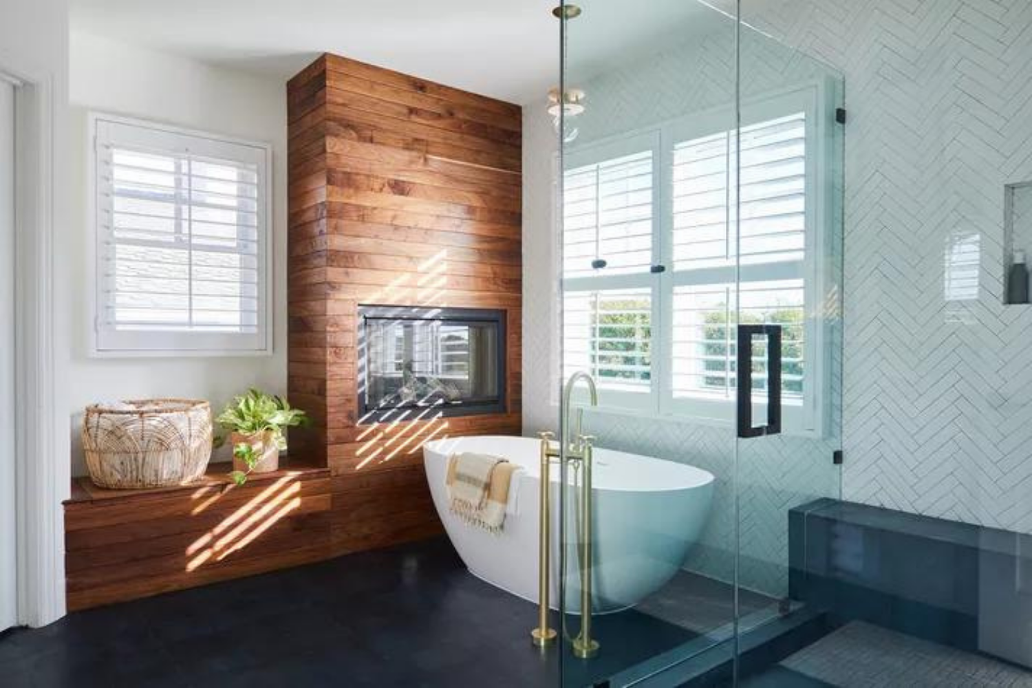
As long as none of the materials are overly glamorous (like shiny metallics), feel free to mix as many as you please. There's no such thing as too many materials. Case in point: this Laura Brophy-designed bathroom, which features wood, marble, and glass.
Supersize Your Shower

If your bathroom is big enough, go big on the shower. The large glass cube divides the space perfectly, giving each area its own distinct look.
Get Creative With Storage

You may be short on storage in a small space, which can put a crimp in your minimalist style. Not to worry; towel ladders exist for this very reason. Not only are they simple in their design, but they're the answer to full cabinets and drawers.
Add Some Drama

In a primarily white space with pops of rattan, a jet-black penny tiled shower is extremely cool and contemporary. It doesn't detract from the space's brightness or minimalist feel, but it does make a big statement.
Focus on the Essentials

In a minimalist space, get only what you need. In this Chelius House of Design bathroom, there may be a few pieces of decor, but all of it serves a specific (and necessary) purpose—from the pendant to the full-length mirror.
Expect the Unexpected

At first glance, this bathroom looks demure and simple. However, upon further inspection, the black-painted legs of the tub and ladder completely up this space's cool factor in a big way. The best part? Achieving this look is super easy to do.
Keep It Consistent

ANDY STAR Modern Wood Frame Bathroom Mirror
Cathie Hong uses only three tones in this minimalist bathroom: matte black, neutral wood, and bright white. None of the colors feel random because they're all used in at least two different elements. For example, the towel holder and faucet are black, the mirror's frame and vanity are both wood, and the walls and sconces are white.
Consider Subtle Shades

This all-white space looks very cool, courtesy of the minty green tiles in the shower. The best part about this kind of look is that you can make it happen with just about any color.
Go Glamorous

Contrary to popular opinion, minimalism and glamour are definitely not mutually exclusive. One of the easiest ways to mix the two styles is to use lots of white, a few pops of black, and, of course, shiny gold-toned hardware whenever you can.
Let the Space Speak for Itself

In this tiny cove, House Sprucing really embraced the idea of minimalism by keeping the space quite bare. Somehow, it just works. Perhaps it's the subtle veining in the marble, which gives the space a bit of variety to feel too stark or sterile.
Use Pattern Sparingly
ANDY STAR Modern Rectangular Bathroom Wall Decor Mirror
The best place to try a pattern is on the bathroom floor because, in most cases, the surface area is small enough not to overtake the space. That said, laying down an aggressive and loud pattern may detract from the minimalist feel of your bathroom. Instead, opt for something a bit more subtle


Laisser un commentaire
Ce site est protégé par hCaptcha, et la Politique de confidentialité et les Conditions de service de hCaptcha s’appliquent.