
The height of luxury just might be having a primary bathroom in your home that looks and feels as opulent and lavish as the spa at a five-star hotel. Imagine slinking away to a freshly drawn bath wrapped up in a plush robe surrounded by stunning decor, mood-enhancing plants, and a sweeping view of the city or countryside visible from floor-to-ceiling windows.
Primary Bathroom
The term “Primary Bathroom” is now widely used to describe the largest bathroom in the home, as it better reflects the space’s purpose. Many realtors, architects, interior designers, and the Real Estate Standards Association have recognized the potentially discriminatory connotations in the term “Master.” Read more about our Diversity and Inclusion Pledge. Diversity and Inclusion Pledge.
While this fantasy might not be attainable depending on your home's square footage and location, there are plenty of ways to give your own bathroom the spa-like upgrade it deserves. Get inspired with these 30 primary bathrooms, plus see ways to transform your space into a sanctuary almost as glamorous as these.
Hang Some Art

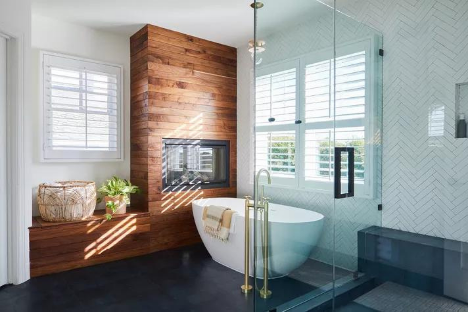
This beautiful primary bathroom combines modern designs with a touch of glamour. Long curtains elevate the space while a large gold towel rack makes a statement, not to mention the tub-side fireplace and potted plant.
Steal the look and hang a print or painting on any open wall space to give your bathroom a simple improvement.
Add Traditional Elements

This all-white bathroom is relatively understated on its own, but a crystal chandelier, colorful rug, and pink flowers truly make the space feel deluxe. If space allows, add a traditional rug in your primary bathroom for an unexpected element of décor.
Go Dark and Moody

This black-and-white primary bathroom feels dramatic and makes a statement without going too extreme thanks to lighter elements like the white paint, gold sconces, and wicker basket.
Aside from installing marble slabs in your bath, find a chic basket to store towels or other bathroom essentials to keep your space tidy and clutter-free.
Keep It Light and Airy

This bathroom is filled with light thanks to large windows and white-painted walls. It also features a freestanding tub surrounded by a dip-dyed stool and delicate plant to finish the easy-breezy look.
Place a rustic stool near the tub to hold your bath essentials, display a candle, or rest your book while taking a soak.
Focus on Texture

This expansive room is covered in wall-to-wall white marble with black veins while silver pendants drape from the ceiling. It looks fresh, clean, and complements the nearby view of the ocean.
For your own bathroom, replace an overhead light with a stylish pendant light like this bathroom to refresh your space with ease.
Do Something Different

The terazzo tile look originally popularized back in the '70s has been making a major design comeback. This primary bathroom has completely embraced the trend, displaying the material from the sink to the walls to the floors.
Make this trend work for your own bathroom and seek out small accent pieces like a candle or tissue box before retiling the entire space.
Mix Styles and Eras

This bright white space features a glamorous silver clawfoot club with a telephone faucet. Although the tub is clearly inspired by late 19th-century glamour, the rest of the décor, including the fringe bath mats, walk-in shower, and potted plant, is decidedly modern and layered.
Copy the vibe and trade in a utilitarian bath mat for one with a bit more style, such as a bold color, or striking print.
Go With Fewer Yet High-Impact Décor

Just a few ultra-stylish pieces completely transform this ordinary space into a ritzy retreat. There's the geometric pendant light, gold faucet, black and white tile, and unique light-wood stool.
In your own bathroom, search for an unexpected accessory like this interesting stool to prop near the tub.
Mimic Natural Surroundings

We love how this design riffs on the coastal oasis outside. And with stunning views of the ocean in the distance, this space doesn't need a lot of décor to make it feel deluxe.
Bring a bit of nature into your bathroom with a potted plant.
Try Something Quirky

Geometric multicolored tiles sit beneath a modern bathtub while contemporary artwork and an iridescent pendant light hangs above. Long, dramatic curtains frame the window, tied back by nautical ropes to create a one-of-a-kind look.
Similarly, if your primary bathroom has a window, hang curtains and try the rope tieback trend for yourself.
Embrace Natural Materials

This rustic primary bathroom looks like something straight out of a wellness retreat. The light-wood panel floors contrast with the pristine rectangular tub while rough twigs replace traditional plants. As the eye travels upward, notice the gold Sputnik chandelier and exposed wood beams.
Give your space a similar rustic makeover and display small branches in a sophisticated vase.
Play With the Layout

Double sinks act as bookends for this uniquely placed tub. Its position in the center of the room adds drama to the space. As if the room wasn't large enough, matching mirrors add even more depth.
Make your primary bath feel larger than it really is with a few strategically placed mirrors.
Pick a Theme

In larger spaces, keeping the look cohesive is key. In this contemporary Rococo-inspired space, pale shades, luxe textures, and glamorous elements tie everything together. Complementary pieces, like the vintage Murano glass chandelier and lucite vanity stool, up the cool factor, too.
Go Graphic

The paneled cabinets and stark black-and-white palette give this cool bathroom a graphic look in the best way. Such a bold color scheme can often make the space feel a bit cold, but transitional shades, like the grey shower and floors, soften it up a bit, and make it feel more welcoming.
Consider All-Black

This monochromatic space is the definition of cool. Dark, matte walls, Ferguson bulbs, and shiny hardware only enhance this moody bathroom's industrial feel.
Minimize the Shine

This space looks more like a five-star spa than it does a residential primary bath, but we'll take it! In our opinion, lots of super-shiny metallic accents can make a bathroom feel a bit futuristic, so keeping all of the metal matte is a bit easier on the eyes.
Layer Your Rugs

Rugs in a bathroom are one of our favorite design choices. Because the floors tend to get pretty wet, a lot of people shy away from rugs while others, like designer Katie Hackworth, double up on rugs. Not only are they super-soft, but they also are an easy way to add some color to your space.
Focus on Lighting

Lighting is a great way to add something unique and personal to your space. Plus, in an all-white space, you really can't go wrong because seemingly every color and style will work. For instance, this bathroom feels uber-contemporary, yet a more bohemian, wood-beaded chandelier fits right in.
Don't Be Afraid of Antiques

In this Pure Salt Interiors Bathroom, the vanity is a repurposed antique chest and, paired with the muted gold faucet, simple mirror, and ocean-blue paint on the walls sets the tone of the space. A gold-trimmed mirror completes the look.
Embrace Your Huge Space

If you're blessed with a large space, use it! In this sprawling bathroom, Lava Interiors built a miniature room for the shower.
Working with a smaller space? Opt for white walls, which tends to trick the eye into thinking a room is bigger than it actually is.
Prioritize Your Needs

If you prefer baths over showers, let yourself splurge on a great tub (or design your space around it). In this large bathroom by Whitney Parkinson, the bathtub, with its own chic light fixture above it, is certainly the space's spotlight.
Don't Skimp on Lighting

Even if your bathroom gets a good deal of natural light, opting for maximum lighting options is always a good idea. After all, once the sun goes down, your space will get pretty dark. Take note of this bright white bathroom with two separate lighting schemes: one over the tub and one for the vanity.
Pick a Central Color

This soothing bathroom boasts a few shades of green: An olive tone on the walls and a rich emerald on the tiled shower. As long as the color you choose doesn't overwhelm the space, you can't go wrong.
If you're going to mix two tones of the same color, try to go light and dark rather than two light and two dark. That way, you'll add dimension to your space.
Expose Your Pipes

Generally speaking, exposed pipes aren't the chicest design choice, but, as always, there's an exception to every rule. Case in point: this ultra-chic patterned bathroom by Becca Interiors. With a beautiful marble sink and dramatic walls, the luxe gold-toned pipes under the sink (which match the faucet) look glamorous, not industrial.
Match Neighboring Spaces

If your primary bath is right off the primary bedroom, try to keep the design of both spaces in sync with each other. For instance, if the bedroom is quiet and pared-down, opting for a maximalist look in the bathroom might be too jarring.
Be Bold

Black is technically neutral, but it feels like a pretty bold choice in a bathroom. Of course, that's not a bad thing!
If you're feeling daring, and want to try something different in your bathroom, go ahead and clad walls in dramatic black marble. Black pops especially well with light wood floating vanities.
Remember Symmetry Is Key

In a small space, symmetry can make a space look bigger than it is. This bathroom is a perfect example. Notice that designer Laura Brophy didn't pare the design down; Brophy just made sure the bold pieces were exactly the same on both sides.
Paint the Door Black

We're not sure why we're not all out here painting our bathroom doors black because they're so cool—especially in a white space with brass accents. This Katie Martinez-designed bathroom is giving us London townhouse vibes in all the right ways.
Add a Pop of Color

This is another spa-like space courtesy of the soothing white surfaces and greenery on the counter. Our favorite element, though? The blue-tiled shower. It is totally unexpected and doesn't detract from the relaxing vibe of the bathroom.
Play With Pattern

When it comes to bathroom tiles, there are almost limitless patterns to try. In our opinion, you can't go wrong with a classic chevron using slightly different-colored gray tiles à la JK In







Laisser un commentaire
Ce site est protégé par hCaptcha, et la Politique de confidentialité et les Conditions de service de hCaptcha s’appliquent.